System Magazine is a biannual publication that features exclusive, long-format interviews with fashion's most influential, powerful, and opinionated individuals. These interviews are complemented by portfolios crafted by the industry's most sought-after image-makers. The challenge for our web design and digital strategy was to retain System Magazine's unique brand identity, while implementing a more enticing approach to encourage users to click and immerse themselves in reading extensive textual articles.
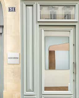
Gallerie Kreo is an avant-garde exhibition space celebrated for its curated displays of contemporary art and design. It serves as a vibrant stage for both rising and established creative minds, continuously pushing boundaries in the worlds of art and design. Our assignment was multi-layered: to create a comprehensive visual identity and a dynamic motion system that could both embody the gallery's forward-thinking ethos and act as a malleable backdrop for its diverse collections.
For the Marine Serre x Selfridges collaboration, we designed an interactive website to accompany the in-situ exhibition. Accessible via iPads on the day of the exhibition, the website served as a digital guide, navigating visitors through the physical space. The project posed a unique challenge: to create a seamless user experience that extended the exhibition's aesthetic into the digital realm while facilitating visitor engagement. By successfully merging the tactile and virtual, we provided a holistic journey that enriched the attendees' exploration of the exhibition.
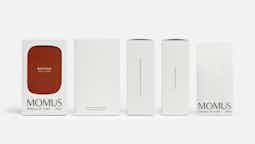
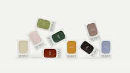
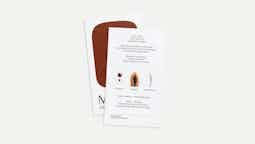
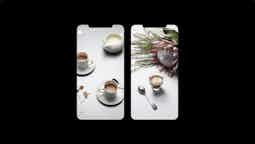
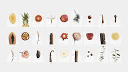
For Momus, a high-end coffee brand founded by veterans of luxury fashion houses, we delivered an all-encompassing brand experience that went beyond your average cup of joe. This ranged from intricate packaging design and logo creation to comprehensive branding strategy, a visually rich website, and even a bespoke customization tool. Our direction was to establish Momus as more than just a coffee brand—our aim was to shape it into a useful lifestyle label. Combining elements of elegance with utilitarian design, we successfully captured the essence of luxury while offering functional, everyday sophistication.

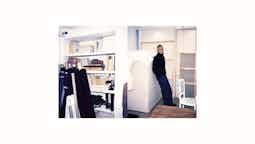
In collaboration with the teams at NoPlans and Atma World, we undertook the ambitious rebranding of LN-CC, a forward-thinking e-commerce platform. The focus was not just on aesthetics, but also on functionality, with a particular emphasis on typography and editorial elements. The aim was to transform the user's shopping experience into an editorial journey, enriching their interaction with the brand while facilitating seamless navigation and purchase processes. By employing a refined typographic approach alongside an elevated editorial layout, we breathed new life into LN-CC's digital presence, reaffirming its status as a curated platform for the fashion-conscious consumer.
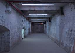
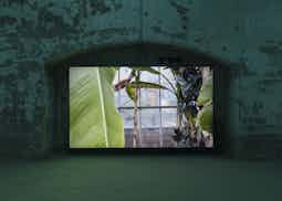
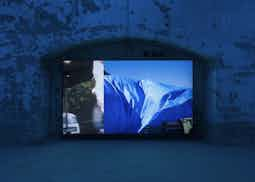
For Tirzah's exhibition at the Sculpture Center in Queens, NYC, we had the unique opportunity to collaborate with artist Shahryar Nashat to create an integrated software and lighting design. The project featured a groundbreaking approach to visual analysis; each frame of a given video sequence was analyzed for its average color, which was then diffused throughout the exhibition space as part of the light design. This real-time color analysis and spatial diffusion created an immersive, dynamic environment that transformed the viewer's experience, allowing them to engage with Tirzah's work in an entirely new dimension. This innovative blend of software engineering and aesthetic interpretation helped to deepen the impact of the exhibition and position it at the intersection of art and technology.
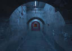
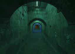
For More or Less Magazine, a publication committed to sustainable living, we had the pleasure of collaborating with NoPlans to design their digital presence. The core challenge was to translate the magazine's eco-conscious ethos into an engaging online experience. We implemented interactive elements specifically designed to encourage users to delve into the articles, thereby giving the textual content a more image-like dimension. The intuitive navigation and interactive layout not only amplify the user's engagement but also fortify the magazine's brand identity in the digital sphere. Through this collaboration, we successfully married sustainability with digital design, reinforcing the magazine's commitment to environmentally responsible storytelling.
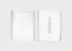
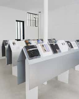
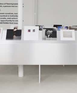
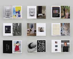
Something Magazine is an avant-garde project we initiated in collaboration with Lise Demartino and Astrid Durand, designed to redefine the conventional magazine format. At its core, the magazine is created live, empowering each participant to craft their own unique publication. We carefully curated a selection of 30 artists to participate, each bringing their distinctive voice and vision to the endeavor. Through this approach, we not only pushed the boundaries of what a magazine can be but also championed the collaborative spirit and individual creativity. The project served as a dynamic, participatory platform, offering a fresh perspective on content curation and artistic expression.
In collaboration with Astrid Durand, we designed and developed a website for Emma Le Doyen, capturing her multifaceted career in photography, drawing, and film. Structured around keywords, the site serves as a dynamic portfolio, showcasing her work across documentary, fashion, and portrait photography, as well as music videos and commercial projects. Our design navigates the breadth of Emma's talents, providing an engaging digital platform to explore her diverse creative outputs.
World Artifacts Society is an e-commerce platform operating in the skateboard subculture, which extends the narrative from its eponymous book into the digital realm. The shop showcases a captivating stroboscopic image sequence, serving as a dynamic digital interpretation of the book's content. The platform blends skate culture with artistic elements, creating a unique space where literature and retail coalesce. It's not just a shop; it's an interactive experience that brings the raw energy and ethos of skateboarding to life, giving users more than just products but a taste of the culture itself.
For Studio Matthieu Meyer, a Paris-based creative direction agency, we crafted a website that reflects their core philosophy of co-creation and diverse range of work. Spanning fashion, art, music, beauty, and design, the studio excels in producing rich editorial and digital content, from visual identities to strategic brand platforms. Our web design captures this multidisciplinary approach, incorporating elements of Mathieu Meyer's extensive experience in the industry—from his ECAL education to collaborations with brands like Balenciaga and Givenchy. The site serves as a digital showcase of their inspiring works, influenced by history, contemporary culture, and future aesthetics.
NON FICTION is a dual entity—both a trend consultancy bureau and a biannual publication focusing on the crossroads of fashion, culture, and commerce. We had the pleasure of exclusively working on the digital aspect of NON FICTION, aiming to seamlessly translate its unique voice in trend forecasting into an online experience. Designed as an interactive platform, the website features insightful essays and forecasts, marrying rigorous analysis with aesthetic sophistication. It serves as an essential digital tool for brands and creatives looking to stay ahead in a rapidly changing environment, enhancing NON FICTION's position as an industry go-to for trends and insights.
For Passage Office, a Paris-based design studio founded by Arthur Fosse and Samuel Perhirin, we had the honor of crafting their website. The duo, acclaimed for their fresh take on furniture and textile design, sought a digital platform that could embody their brand's essence and narrate their creative journey. Our goal was to build an online experience that would serve as both a portfolio and a showroom, seamlessly merging aesthetic beauty with functionality. With interactive galleries and engaging narratives, we aimed to capture the meticulous craftsmanship and innovative spirit that have earned Passage Office its rapidly growing recognition, including prestigious awards and museum acquisitions. This digital platform not only showcases their portfolio but also enriches the visitor's understanding of the philosophy and stories behind each creation.


